Content Strategy > Actionable Insights
Creating data-driven recommendations that scale
The problem
With no clear guidance system in place, the Shopify Home page was starting to feel like a mess. Over the years, teams had added cards to Home based on their own individual KPIs, turning a once simple Home page into an overwhelming feed with random CTAs and no clear messaging hierarchy or storyline.
Not only was the engagement with these cards super low, averaging around 2% CTR, but users let us know they weren’t happy either. We received lots of direct feedback around the Home cards feeling salesy, irrelevant, and annoying.
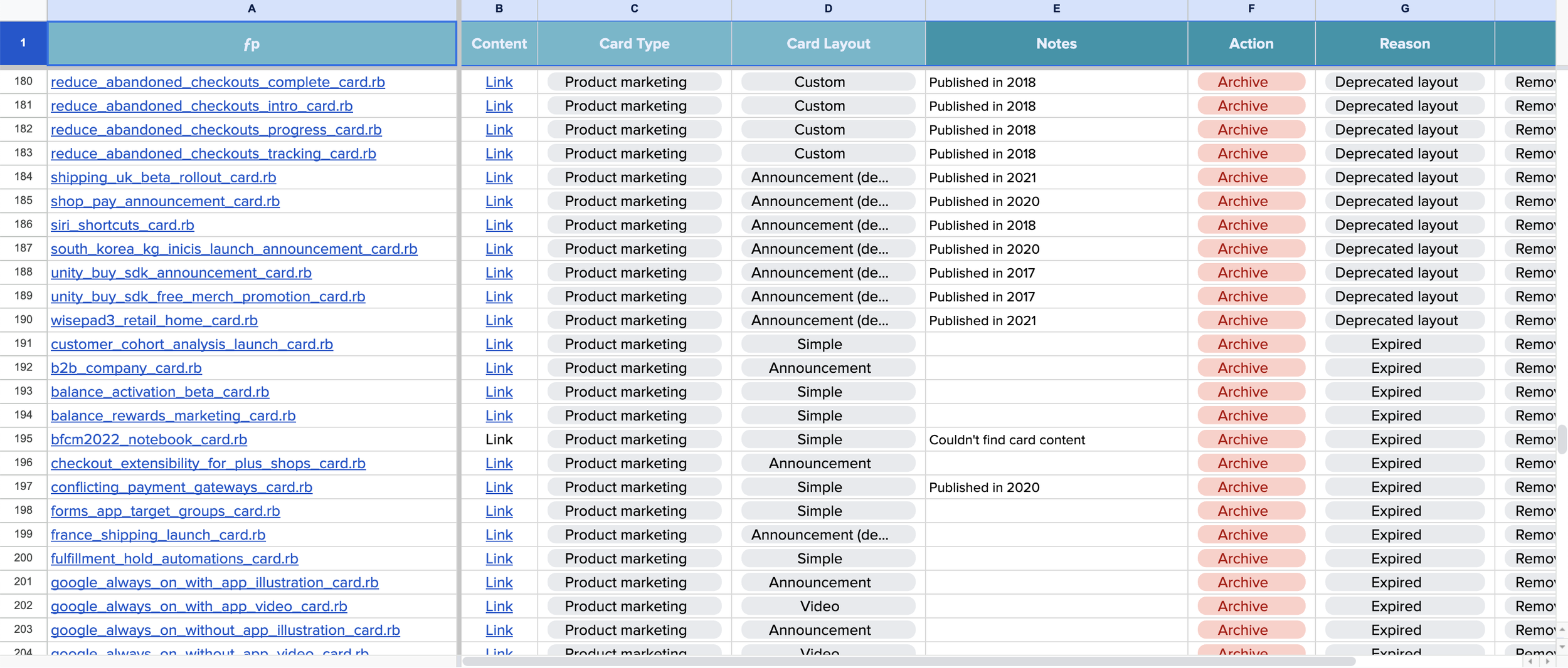
I partnered with a content designer from Core (owners of Home) to conduct an audit of the existing Home Cards.
Sourcing the data
We knew users were more likely to engage with content if it was personalized and data-informed. So we set out to make a new, more compelling, data-driven Home card recommendation system.
Using the audit as their guiding light, the growth data science team examined where we might find meaningful connections between store metrics like site speed and abandoned cart rate and the recommended actions from the existing Home cards.
To create the perfect audience for these new actionable insights, they also looked at:
Merchant segments
Data pattern types (month over month, cohort comparison, etc)
Key metrics vs driver metrics
Actions
Merchant outcomes
Once we have a few solid audience samples created, UX got to work on the designs.

The design
My UX design partner and I worked on dozens of iterations of the actionable insight card. Early versions of the card were flatter, less dynamic feeling, and focused more heavily on the problem than the solution, and felt a bit negative and discouraging.
After several rounds of brainstorming, feedback with the stakeholders, and trial and error, we ended up with a new design that placed a more equal weight on the problem (insight) and the solution (action). These new designs felt more clear and balanced, both visually and messaging-wise.
Framing the actions
Once I had an idea of what our preferred actions would be, I got to work crafting a content strategy for the recommendation part of the actionable insight (right side). This content went through several iterations before we landed on the final scalable content strategy.
Crafting a data viz story
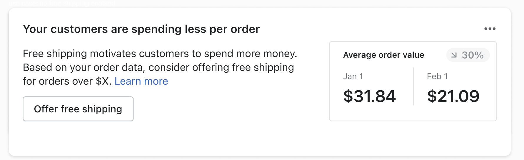
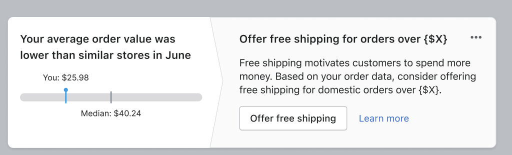
I paired with several designers and data scientists to craft a meaningful data visualization story on the left side of the card. It needed to be eye-catchy, but not scary. Motivational, but not fluffy. Accurate, but not confusing.
Here are two presentations we ended up with – the top showing cohort comparative data, the bottom showing a month-over-month decline. The goal was to design these data viz sets to be interchangeable, letting the algorithm determine when to surface which data viz. The action on the right is the same and works for either data types.
Scaling the pattern
For this experiment, we launched 21 unique actionable insights. The data metrics included:
Average order value
Abandoned cart rate
Add to cart rate
Online store traffic
International conversion
This new system allowed us to rank suggestions based on importance to the merchant, showing them only a few of the most time-sensitive or impactful actions at once.
Early results were extremely positive, with some insights having up to a 75% task completion rate. User feedback also indicated a highly positive sentiment toward these new data-driven recommendations. The result was a cleaner, smarter home feed with more compelling, engaging recommendation cards.
New: V1 (better, but not great)

New: Final design


Before: old home card design
